Multiple Visual Tools
The FinOL provides a suite of visualization tools to facilitate
a comprehensive evaluation of data-driven OLPS research. Here are some
examples:
Loss Visualization
Loss visualization is crucial for understanding model performance during training and validation. It helps identify overfitting and underfitting issues, allowing for better hyper-parameters tuning.

Training and Validation Loss Trends
Hyper-parameters Tuning Process Visualization
Visualizing the hyper-parameters tuning process can provide insights into how different parameters affect model performance. This helps in selecting the most effective parameters for improved results.
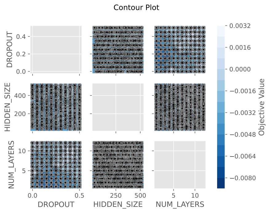
Hyper-parameters Tuning Contour Plot

Empirical Distribution Function of Hyper-parameters

Optimization History of Hyper-parameters Search

Parallel Coordinate Plot of Hyper-parameters Importance

Hyper-parameters Importance Analysis
Ranking of Hyper-parameters Based on Performance

Slicing Through Hyper-parameters Space
Daily Cumulative Wealth (DCW) Visualization
As profitability is the ultimate goal of trading, the DCW trajectories directly showcase the cumulative returns of methods over time. Higher and more stable DCW curves indicate stronger capability to steadily accumulate profits in the long run.
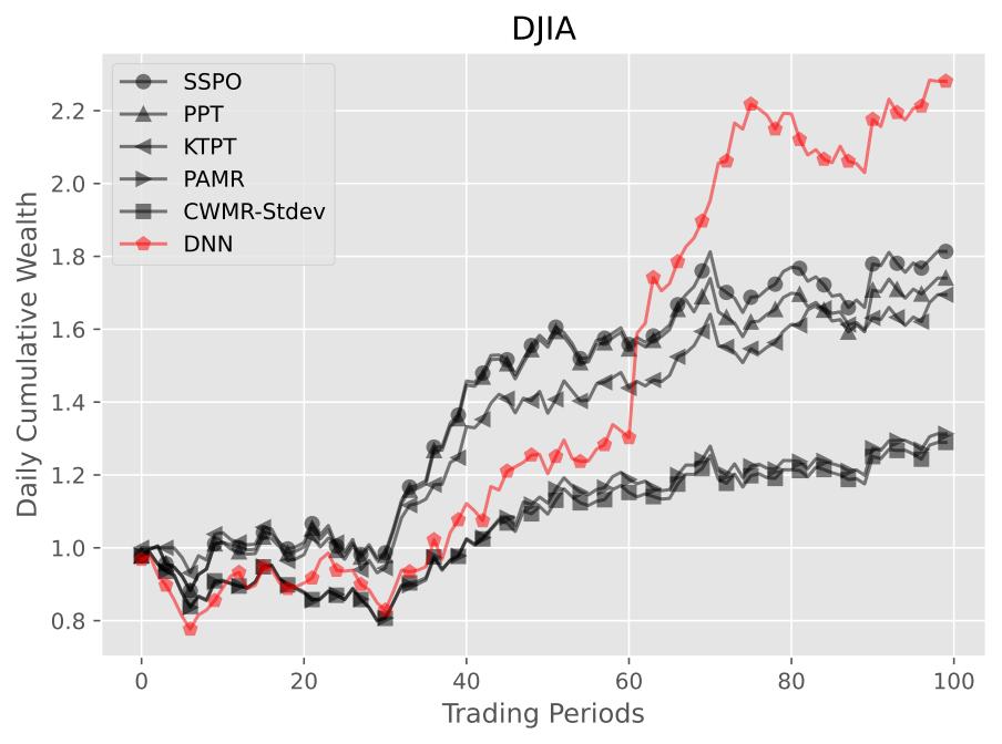
Example Results of Daily Cumulative Wealth on DJIA
Daily Maximum DrawDown (DMDD) Visualization
The DMDD visualization illustrates the largest peak-to-trough decline in portfolio value over a specified period. This metric is essential for assessing the risk associated with OLPS methods, as it highlights the potential for significant losses. By analyzing DMDD trajectories, researchers can better understand the downside risks of different OLPS methods, enabling them to make more informed decisions regarding risk management and capital allocation.

Example Results of Daily Maximum DrawDown on DJIA
Transaction Cost-Adjusted Cumulative Wealth (TCW) Visualization
The TCW metric evaluates profitability under realistic transaction costs. It penalizes portfolio rebalancing by deducting proportional costs based on the turnover amount each period. Lower TCW indicates greater performance deterioration from increased rebalancing amounts. By accounting for real-world frictions, TCW provides a practical assessment complementing the raw profitability metrics of data-driven OLPS methods.

Example Results of Transaction Cost-Adjusted Cumulative Wealth on DJIA
Comprehensive Radar Chart
The comprehensive radar chart provides a visual representation of multiple performance metrics for OLPS methods. By displaying these metrics in a single view, it allows for easy comparison of strengths and weaknesses across different methods. This visualization helps researchers quickly assess which methods excel in specific dimensions.

Example Results of Radar Chart on DJIA